
three techniques for detecting anomalies in officers' race-based data reporting during traffic and pedestrian stops
In a recent story by the San Francisco Chronicle, the ED of San Francisco’s Department of Police Accountability, highlighted a troubling issue within the city’s police department: the misreporting of race-based data during traffic and pedestrian stops.
Such discrepancies pose a serious challenge to the integrity of databases intended to track biased policing. As the SF Chronicle notes, the mislabeling of races or entering multiple racial categories to obscure actual demographic data are just some of the ways this misreporting occurs.
Can quantitative analysis help us uncover such discrepancies systematically? Could we enhance oversight of police conduct by leveraging data science to detect when officers misreport race during traffic stops?
I’m going to explore three possible methods, applied on data I simulated (code shared below), that could be used to do anomaly detection on police traffic stop data. Each one offers a distinct lens to scrutinize the data for inconsistencies.
-
Chi-Square. Tests if the distribution of reported races by each officer is statistically different from the distribution we would expect to see based on the overall data. We can use a chi2 test to detect whether the frequency of each race reported by an officer is unusually high or unusually low compared to what would be expected if their reports were distributed similarly to the overall officer population.
-
K-means. Groups data into clusters based on feature similarity. We can cluster officers based on the proportions of races they report. Outliers might suggest anomalous behavior, suggesting consistently different reporting patterns from their colleagues.
-
Residuals. Trains a logistic regression model (multinomial classification) to predict the race of a subject based on other known features associated with the event (e.g., time of day, subject age, subject gender). By examining the difference between the predicted probability and the actual reported value (the residual), we can identify officers whose reports consistently diverge from model predictions.
All R code for simulating the data and analyzing it using the three methods shared at the bottom of the post.
chi-square test
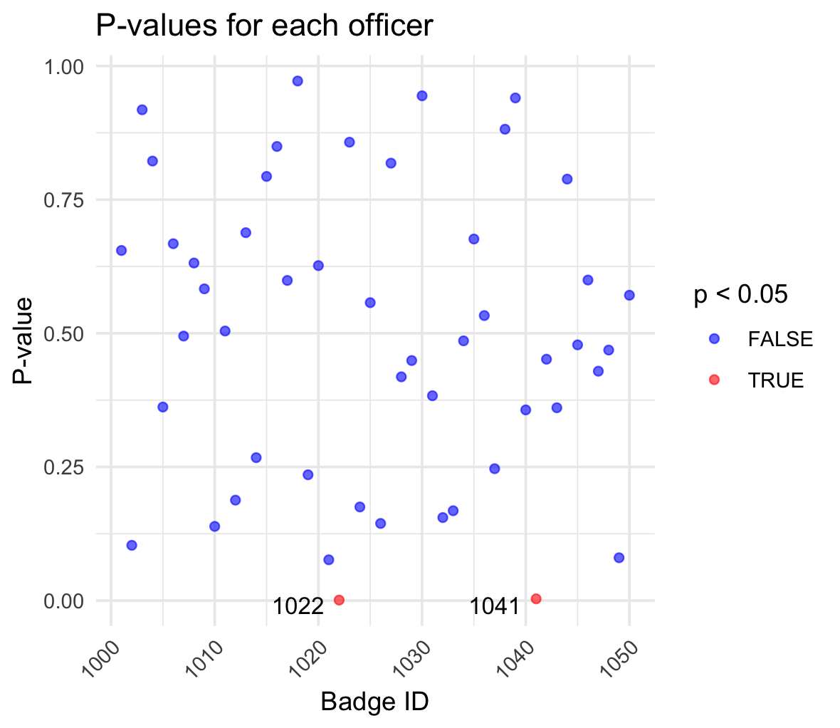
The results of a Chi-square test applied to the race-based data reported by police officers, aimed at identifying those officers whose reporting patterns significantly differ from expected norms. Each point on the graph represents an officer, plotted against their badge ID on the x-axis. The corresponding p-value from the Chi-square test is plotted on the y-axis.
The color coding is particularly telling. Blue points indicate officers for whom the test did not find statistically significant anomalies in race-based reporting (p-value >= 0.05), suggesting their data aligns with the overall distribution. Red points highlight officers (badges 1022 and 1041 in particular) whose data reporting was found to be significantly different (p-value < 0.05).
k-means clustering
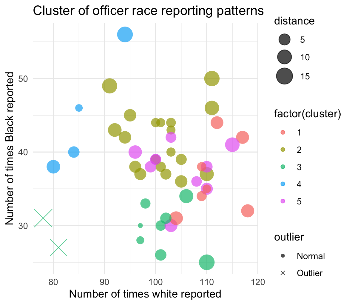
The results of a cluster analysis on the race reporting patterns of police officers, reflecting how often they report white and Black individuals during traffic stops. Each dot represents an officer, plotted according to the number of times they have reported stopping white and Black individuals.
The colours of the points indicate different clusters, each representing a group of officers with similar race-based reporting behaviors. Similarity could be read to mean different things - it could suggest similar operational areas or potentially shared biases in race-based reporting practices, for example.
The sizes of the dots vary with the distance from the cluster’s centroid. Larger dots represent officers whose reporting patterns are more divergent from their group’s norm. Smaller dots represent officers whose race-based data reporting practices are more similar to their group’s norm.
Outliers are identified by an “X”, where an outlier is an officer whose reporting patterns are markedly different from others in their cluster. These outliers could indicate cases where individual officers may be misreporting races more frequently than their fellow officers, possibly intentionally.
logistic regression residuals
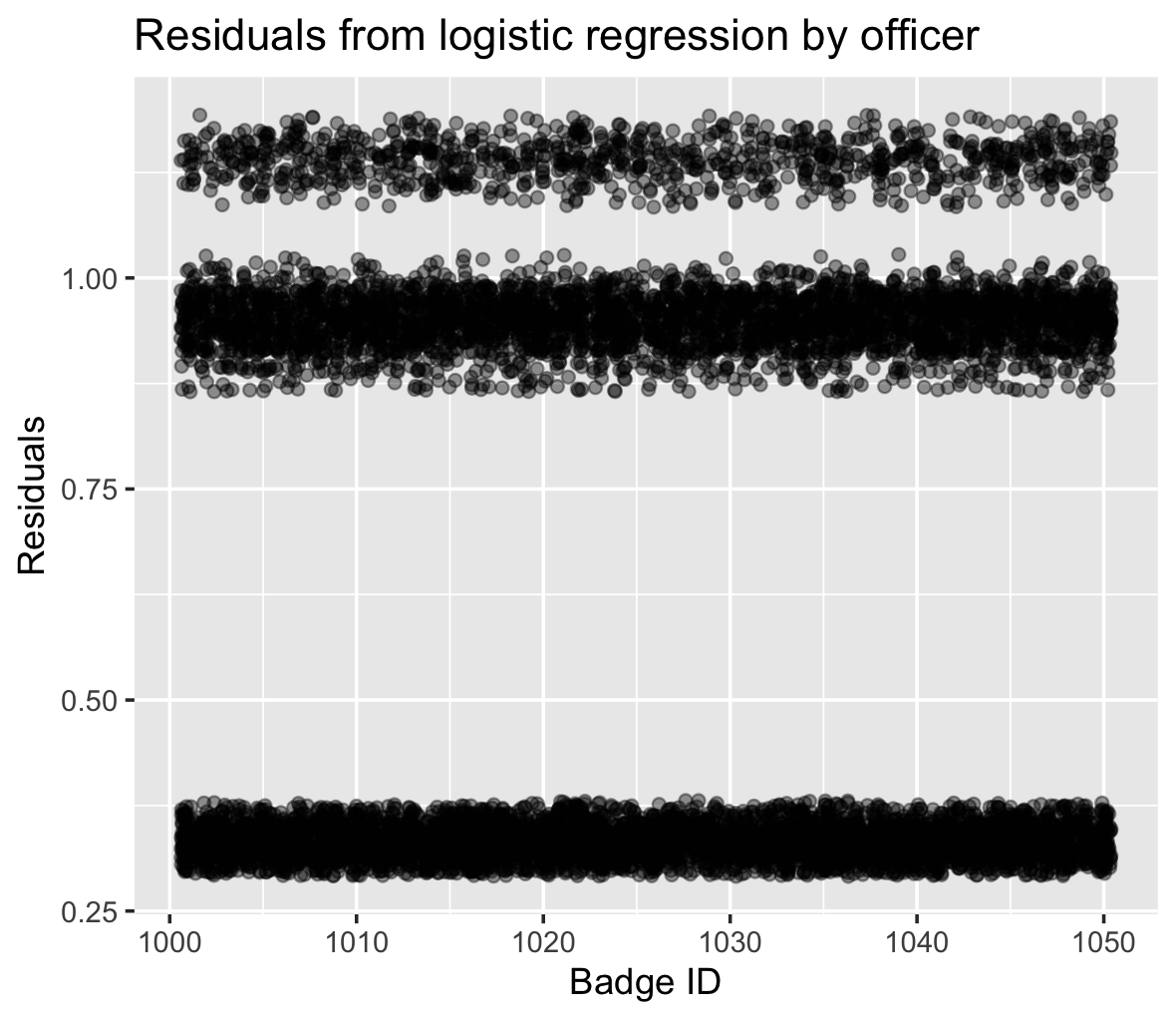
The residuals from a multinomial classifier model designed to predict the race-based data reported by officers based on other known features in the database, such as time of day, age, and gender of subjects. Each point on the graph corresponds to an officer, charted by their badge ID on the x-axis and the residual value on the y-axis. Residuals measure the difference between the actual reported races and those predicted by the model. The larger the residuals, the greater the discrepancy between expected and reported values.
We can see the final result is separated into “bands”. The clustering of residuals across different bands suggests varying degrees of alignment between predicted and actual race reporting. Officers whose residuals fall in the upper bands might be entering race-based data in a manner inconsistent with predictive factors, hinting at potential biases to be inspected further. The very dense band closer to the x-axis, where residuals are smaller, indicates officers whose reporting aligns most closely with the model’s predictions, i.e., less anomalous.
code
required libraries and data simulation
# load necessary libraries
library(dplyr)
library(ggplot2)
library(caret)
library(cluster)
library(tidyr)
library(reshape2)
library(ggrepel)
library(ggforce)

set.seed(123)  # set seed for reproducibility

# generate main data
n <- 10000  # Number of traffic stops
traffic_stops <- data.frame(
  traffic_stop_id = 1:n,
  time_of_day = sample(c("Morning", "Afternoon", "Evening", "Night"), n, replace = TRUE, prob = c(0.25, 0.30, 0.20, 0.25)),
  subject_age = sample(18:70, n, replace = TRUE),
  subject_gender = sample(c("Male", "Female"), n, replace = TRUE, prob = c(0.6, 0.4)),
  subject_race = sample(c("White", "Black", "Latino", "Asian"), n, replace = TRUE, prob = c(0.50, 0.20, 0.20, 0.10)),
  badge_id = sample(1001:1050, n, replace = TRUE),
  division = sample(c("North", "South", "East", "West"), n, replace = TRUE)
)

# introduce anomalies: certain officers misreport race
anomalous_officers <- sample(1001:1050, 5)  # 5 officers out of 50 are anomalous
anomaly_entries <- sample(1:n, 500)  # 500 entries out of 10,000 will be anomalies

# function to misreport race
misreport_race <- function(race) {
  race_sample <- c("White", "Black", "Latino", "Asian")
  return(sample(race_sample[race_sample != race], 1))
}

# apply anomalies to dataset
traffic_stops$subject_race[traffic_stops$badge_id %in% anomalous_officers & 1:n %in% anomaly_entries] <-
  sapply(traffic_stops$subject_race[traffic_stops$badge_id %in% anomalous_officers & 1:n %in% anomaly_entries], misreport_race)
chi-square test
# chi2 test
# calculate observed counts of race reports per officer
officer_race_counts <- traffic_stops %>%
  group_by(badge_id, subject_race) %>%
  summarise(count = n(), .groups = "drop")

# convert to wide format to facilitate calculations
wide_race_counts <- pivot_wider(officer_race_counts, names_from = subject_race, values_from = count, values_fill = list(count = 0))

# calculate total stops per officer to determine expected counts
wide_race_counts$total_stops <- rowSums(wide_race_counts[, -1])

# using overall race probabilities to calculate expected counts
overall_race_probs <- prop.table(table(traffic_stops$subject_race))
race_names <- names(overall_race_probs)

# expected counts for each race per officer based on their total stops
for(race in race_names) {
  wide_race_counts[[paste("expected", race, sep = "_")]] <- wide_race_counts$total_stops * overall_race_probs[race]
}

# calculate observed and expected counts for chi2 test
observed_and_expected <- wide_race_counts %>%
  mutate_at(vars(matches("^White$|^Black$|^Latino$|^Asian$")), list(observed = ~ .)) %>%
  mutate(across(starts_with("expected"), ~ as.numeric(.), .names = "{.col}_num")) %>%
  rowwise() %>%
  mutate(
    chi_square_result = list(chisq.test(
      x = c(White_observed, Black_observed, Latino_observed, Asian_observed),
      p = c(expected_White_num, expected_Black_num, expected_Latino_num, expected_Asian_num),
      rescale.p = TRUE
    ))
  ) %>%
  ungroup()

# extract p-values from the chi2 test results
observed_and_expected$chi_square_p_value <- sapply(observed_and_expected$chi_square_result, function(x) x$p.value)

# visualize the chi2 test results
ggplot(observed_and_expected, aes(x = badge_id, y = chi_square_p_value)) +
  geom_point(aes(color = chi_square_p_value < 0.05), alpha = 0.6) +
  geom_text_repel(
    aes(label = ifelse(chi_square_p_value < 0.05, as.character(badge_id), "")),
    box.padding = 0.35,
    point.padding = 0.5,
    segment.color = 'grey50',
    size = 3.5,
    min.segment.length = 0.1
  ) +
  scale_color_manual(values = c("TRUE" = "red", "FALSE" = "blue")) +
  labs(title = "P-values for each officer", x = "Badge ID", y = "P-value", colour = "p < 0.05") +
  theme_minimal() +
  theme(axis.text.x = element_text(angle = 45, hjust = 1))
k-means clustering
# 2. k-means clustering
race_profiles <- dcast(officer_race_counts, badge_id ~ subject_race, value.var = "count", fill = 0)

clusters <- kmeans(scale(race_profiles[,-1]), centers = 5)

race_profiles$cluster <- clusters$cluster

# calculate centroids of each cluster
centroids <- race_profiles %>%
  group_by(cluster) %>%
  summarise(centroid_White = mean(White), centroid_Black = mean(Black))

# join centroids back to the main data
race_profiles <- race_profiles %>%
  left_join(centroids, by = "cluster")

# calculate distance from centroid
race_profiles <- race_profiles %>%
  mutate(distance = sqrt((White - centroid_White)^2 + (Black - centroid_Black)^2))

# determine outliers - customize threshold as needed
threshold <- mean(race_profiles$distance) + sd(race_profiles$distance) * 2
race_profiles <- race_profiles %>%
  mutate(outlier = ifelse(distance > threshold, "Outlier", "Normal"))

# plotting with enhancements
ggplot(race_profiles, aes(x = White, y = Black, color = factor(cluster))) +
  geom_point(aes(size = distance, shape = outlier), alpha = 0.7) +
  scale_size_continuous(range = c(2, 8)) +
  scale_shape_manual(values = c("Normal" = 16, "Outlier" = 4)) +
  labs(title = "Cluster of officer race reporting patterns",
       x = "Number of times white reported",
       y = "Number of times Black reported") +
  theme_minimal() +
  theme(legend.position = "right")
residual analysis
# 3. logistic regression residuals
traffic_stops$subject_race <- as.factor(traffic_stops$subject_race)
model <- train(subject_race ~ time_of_day + subject_age + subject_gender + division, data = traffic_stops, method = "multinom", trControl = trainControl(method = "none"))
predicted_prob <- predict(model, traffic_stops, type = "prob")
residuals <- rowSums((model.matrix(~ subject_race - 1, traffic_stops) - predicted_prob)^2)

# visualizing residuals
ggplot(traffic_stops, aes(x = badge_id, y = residuals)) +
  geom_jitter(alpha = 0.4) +
  labs(title = "Residuals from logistic regression by officer", x = "Badge ID", y = "Residuals")